lemlem
Lemlem is an e-commerce fashion brand that doubles as a non-profit organization. It focuses on empowering women and providing consumers with an opportunity to give and evoke change. My team and I aim to improve their website by placing the brand’s mission statement at the forefront.
Timeline
2 weeks
My Role
UX/UI Designer
Team
Christine S, Linda R, Karen N (UX/UI Designers)
Tools Used
Figma, Adobe Photoshop, Miro, InVision, Webflow
The problem
Ethical or sustainable fashion takes into account the full lifecycle of the product and looks at everyone and everything being affected by it, from the environment, to the workers. It’s quite incredible to think we might change the world through fashion. There are brands working diligently to help make a difference. While doing our research, we came across lemlem.
Upon first glance, lemlem looks like any other boutique that transferred its sales online. But, that was the problem: it looked like your average boutique instead of the recognized brand in the fashion industry that it is. Some other key issues were that their mission statement and cause was not clear and their website visuals conveyed a very different impression of their price point from what it truly was.
Our goal is to create an enhanced shopping experience with educating users on the mission at the homepage as well as bringing luxury-focused user interface to match up with product pricing.
User research
Heuristic Evaluations
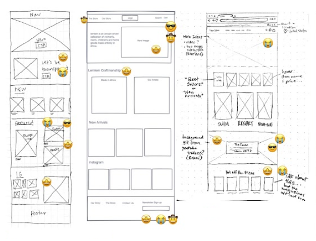
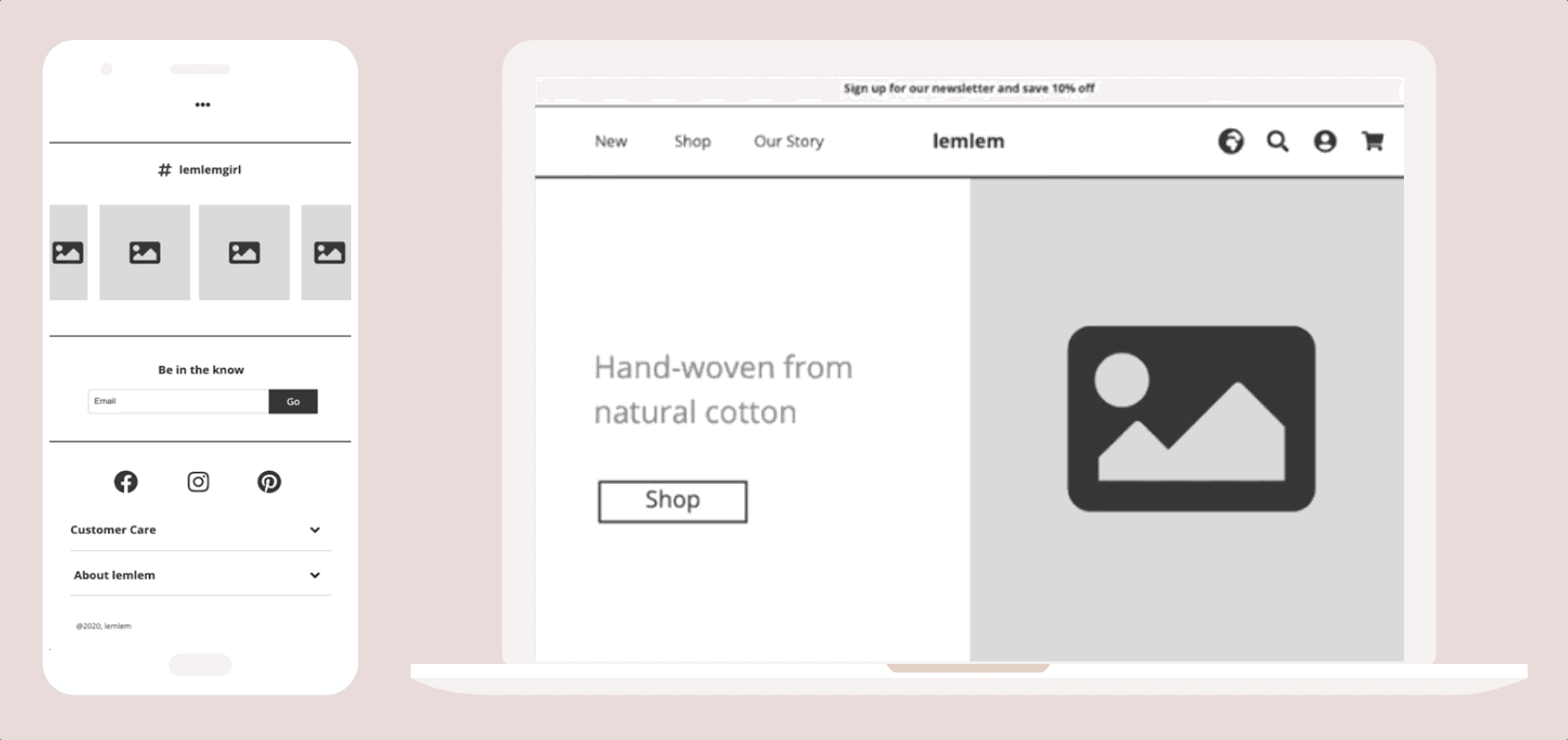
We started out with conducting a heuristic evaluation on the current website.
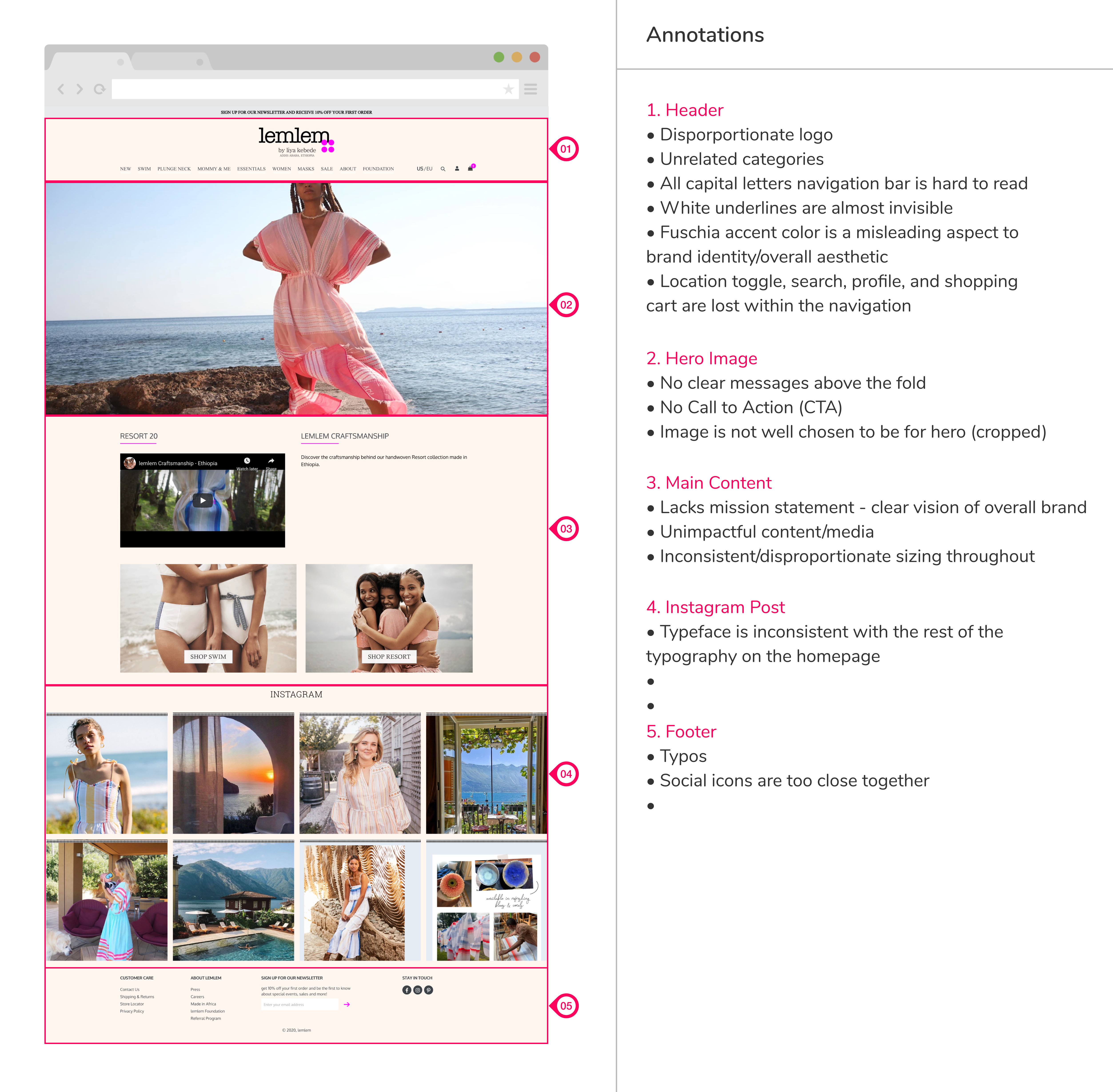
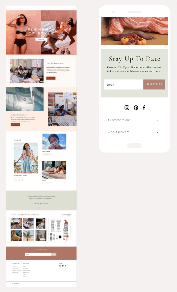
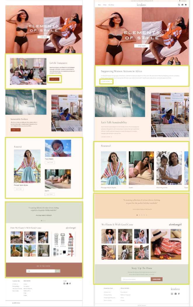
On the homepage, some main UI issues that we noticed that are:
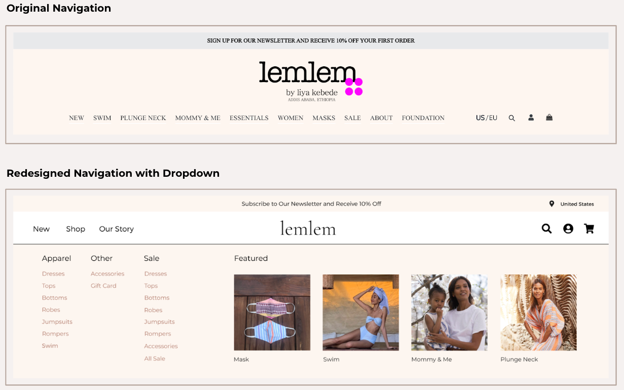
  • The top navigation has some confusing categories.
  • There are no clear messages or call to actions above the fold.
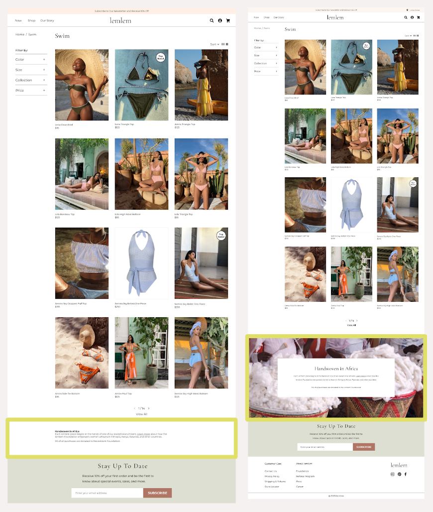
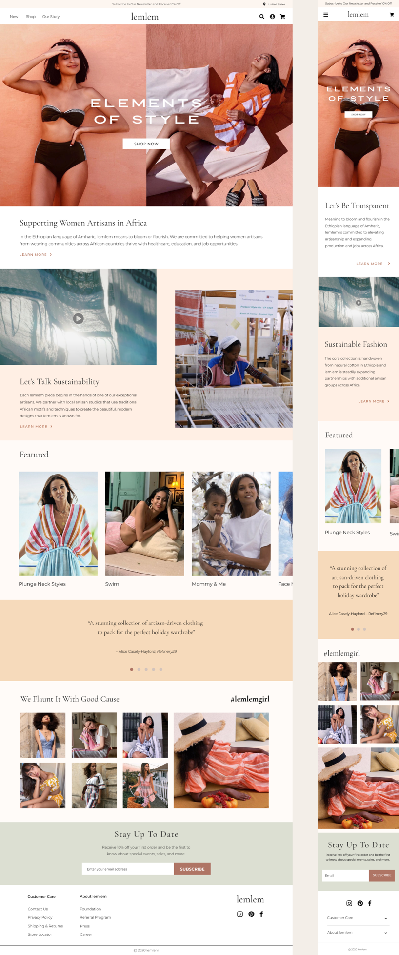
  • They have such a great cause and amazing story, but they’re not properly represented on the homepage and has been instead, tucked away into the end of their navigation.
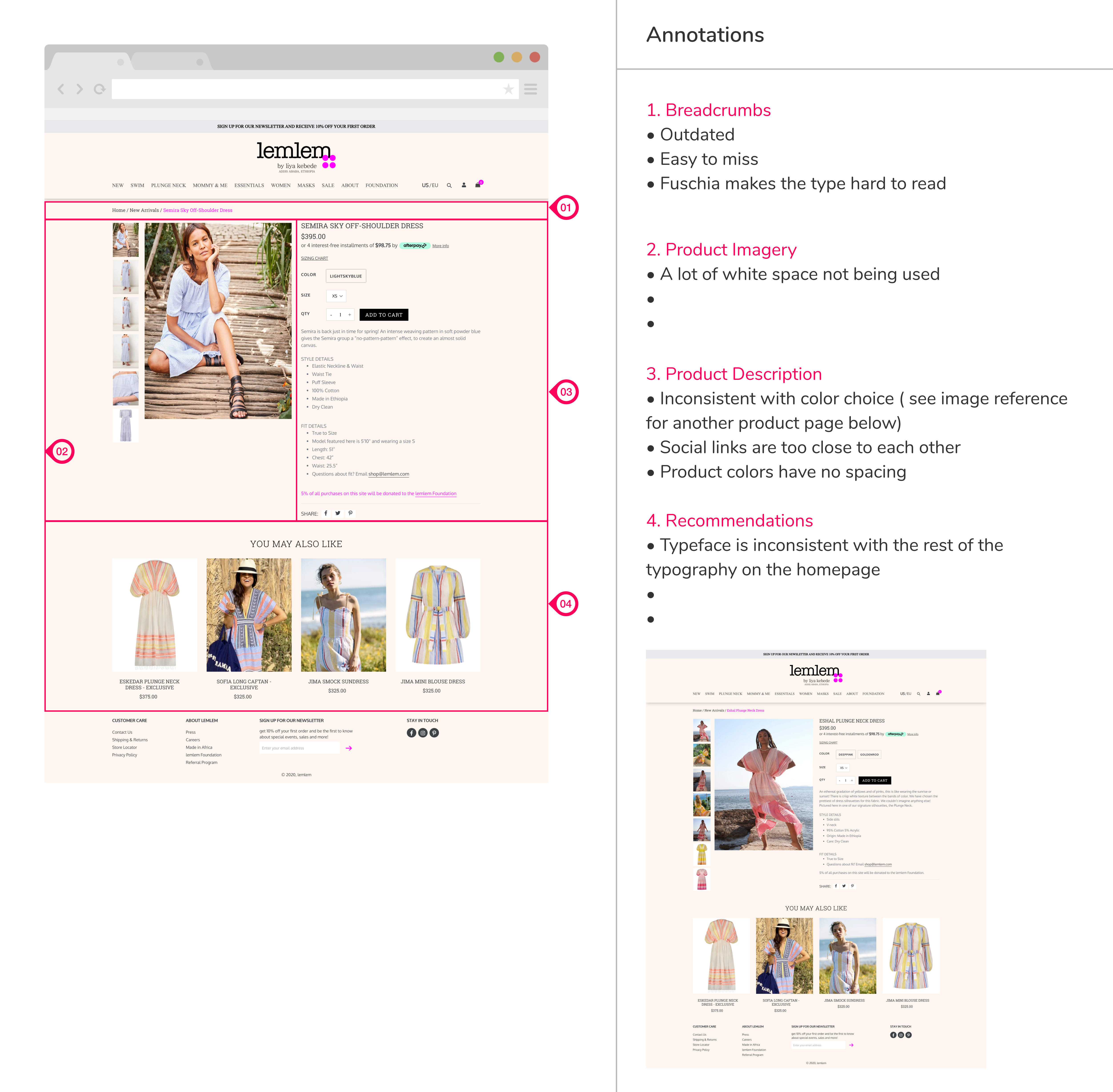
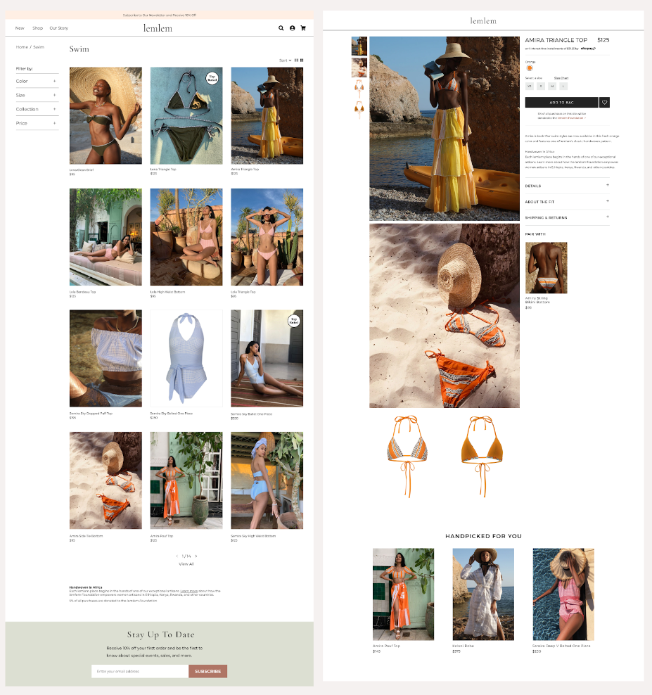
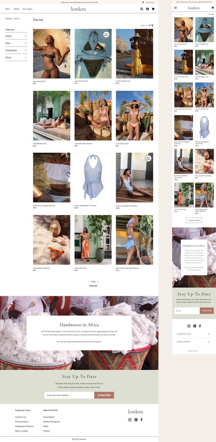
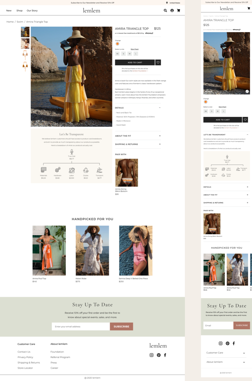
On the product page, we noticed there are inconsistent colors and font choices. The overall design looks like a Shopify theme and is very basic, outdated, and not well-maintained.
Competitor Analysis
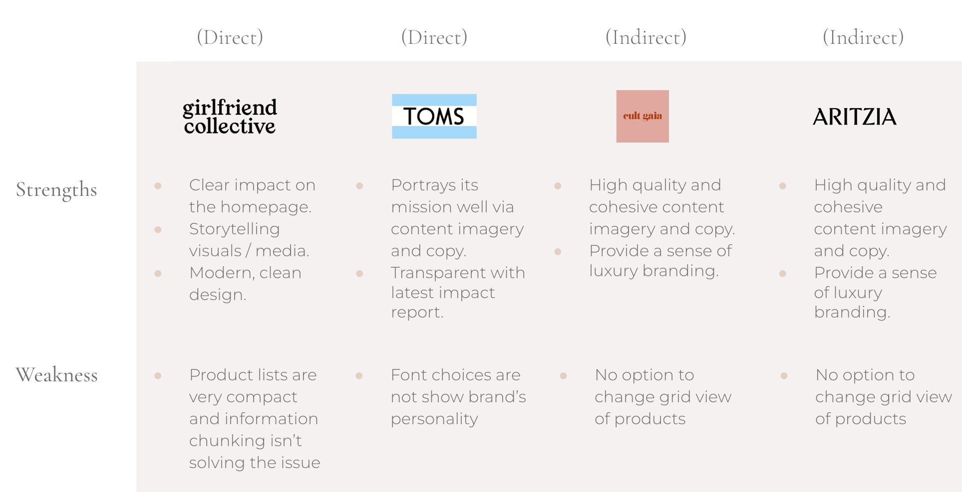
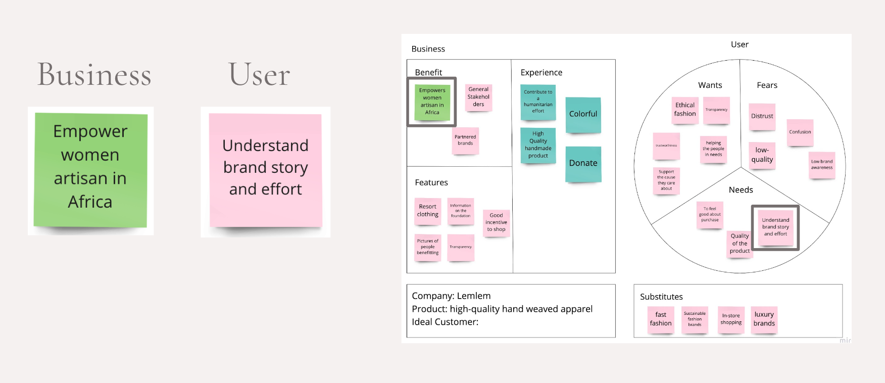
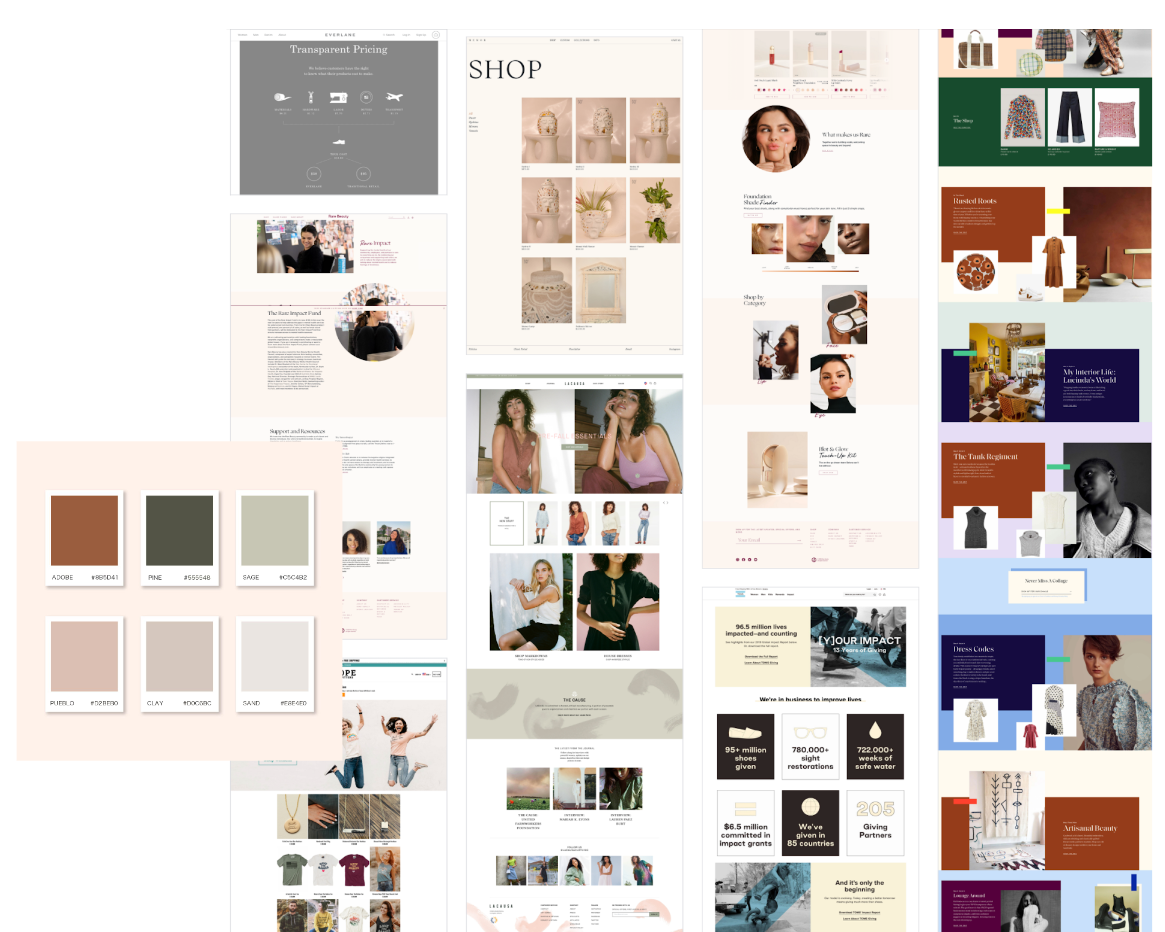
To have a better understanding of Lemlem website’s strengths and weaknesses, we’ve conducted competitor analysis. We chose two direct and indirect competitors. Direct competitors were clearly showing their mission statement and brand story on the homepage with charts and images. Other brands were providing high-quality content imagery, and their modern and clean design adds credibility to their price point.
Interview Insights
In order to understand the problems of the existing website and the needs of target customers in-depth, we created a user research plan and conducted interviews and surveys.
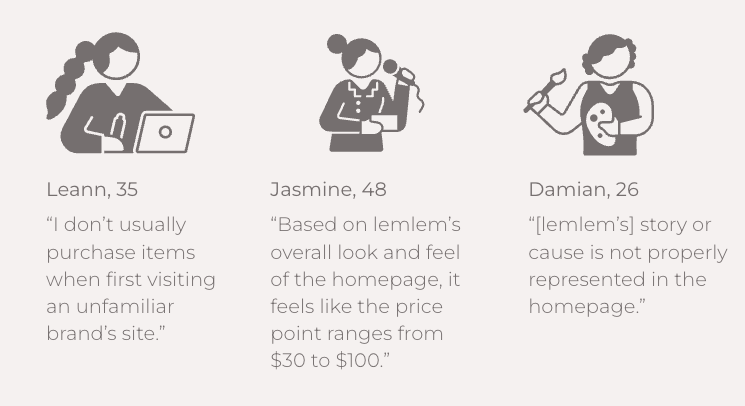
We interviewed 5 people and got similar results as in the SWOT analysis. Most of the participants said the brand story wasn't properly displayed on the homepage, and the high price didn't fit the website's overall look and feel.
Survey Data
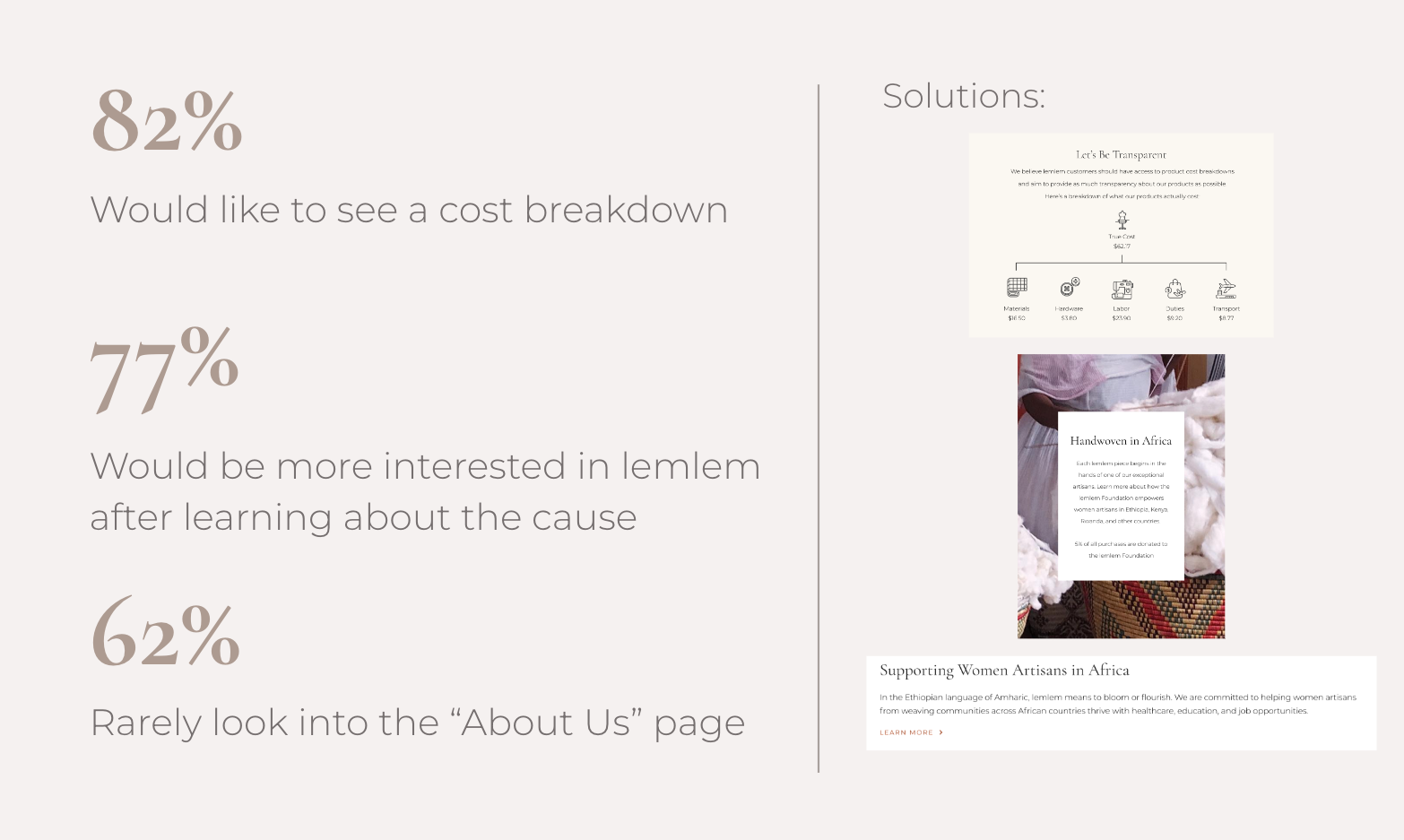
35 people took part in a survey created through Google Forms.
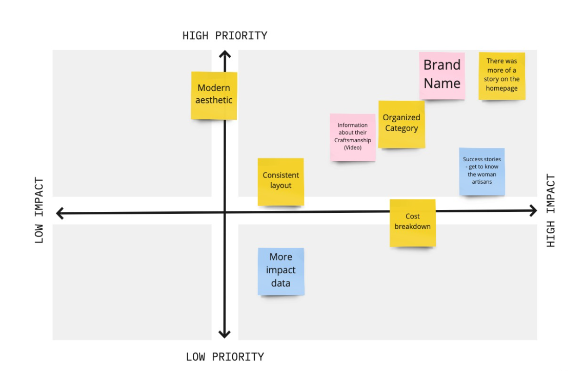
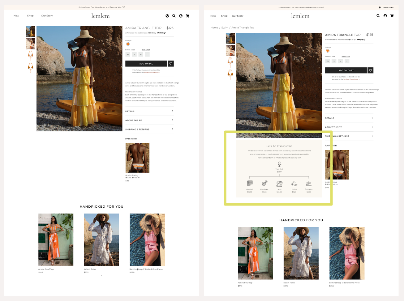
  • 82% said they would like to see a cost analysis.
  • 77% said they were more interested in lemlem's product after learning more about the cause and story.
  • 62% said they rarely see the "About Us" page.
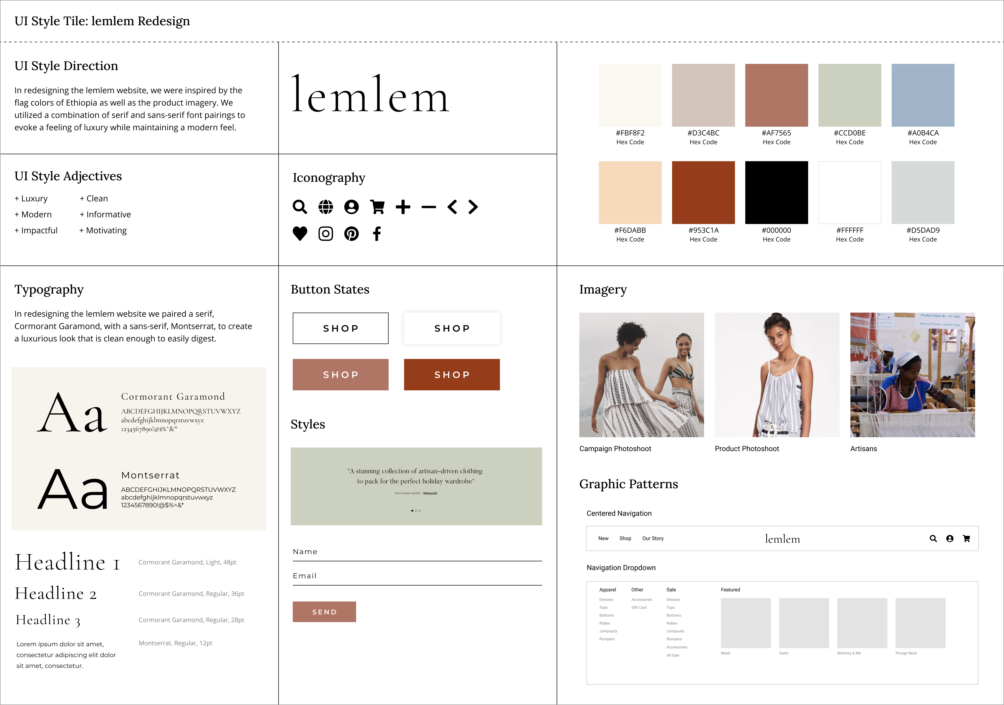
Due to this research data, we have decided to place a mission statement on our home page and a cost breakdown chart on each product page.
User Persona
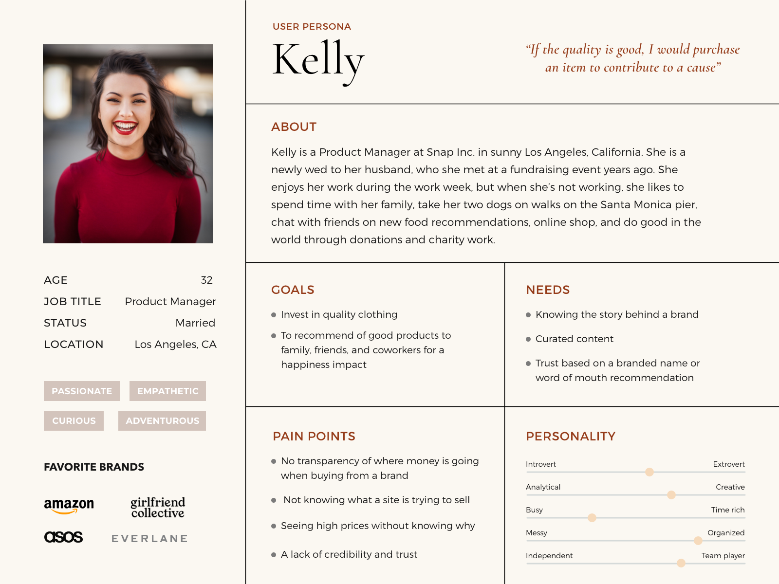
Through user research, we were able to narrow down our target user and create our user persona.
Kelly, a product manager who lives in Los Angeles and recently married her husband who she met at a fundraising event years ago. She loves doing good in the world through donations and charity work and she wants to invest in quality clothing that she can recommend with confidence to her friends and family.
Definition
User Journey
When visiting a fashion e-commerce site for the first time, Kelly — a frequent shopper that loves contributing — needs to know about the cause behind the brand in order to create a sense of trust and increase her interest in their products despite high price points.
Kelly was browsing Instagram and daydreaming about a long vacation in Mexico after the pandemic. On her friend’s story, Kelly sees a gorgeous swimsuit and taps on the brand’s tag, scans their Instagram, and explores their website. She is drawn in by the modern interface and loves that their products help women artisans in Africa thrive. Feeling inspired, she completes her first purchase during that same visit. A week later, Kelly receives her purchase in the mail, posts a photo of her new swimsuit, and tags @lemlem!
After creating this scenario, we began to feel Kelly excitement which increased our empathy and further motivated us.
User Flow
Mapping out Kelly’s main user flow helped us identify exactly which pages and touchpoints we would be focusing on.
Problem Statement:
We have observed that lemlem.com's current design is not meeting cohesive branding standards from product to service visuals and lacks transparency on their mission statement throughout its main pages.
Ideation
Feature Prioritization Matrix
We looked back at our research and discussed content and features that would lead us to a more cohesive and transparent lemlem. With this matrix, our priorities became clear.
  • Modern aesthetic
  • More impact data
  • More of a storyline on the homepage
Value Proposition
Standing between the lemlem brand and their users, we determined that by elevating their interface and highlighting their impact, lemlem would experience an increase in sales and be able to continue helping women artisans in Africa.
Information Architecture
Thinking about our users’ needs, behaviors, and experience, our business goals, and our content, we rebuilt our top navigation and our footer.
In the top navigation, we reduced primary items to emphasize Shop and Our Story. We also reduced the amount of items in our footer to create a clean, modern look, which can be observed in our prototype.
Prototyping
Sketches
We began conceptualizing the framework of our redesign with sketches. We did this because we wanted to make sense of what lemlem’s homepage would look like amongst 4 designers, but making it look cohesive and well united. After we laid out all of our sketches, we did a fun dot voting by emojis to visualize elements in each wireframe we liked.
Lo-Fidelity Prototype
We were able to combine strong elements from our sketches to create this low-fidelity that has a:
  • Very strong hero with a CTA
  • Categories featured
  • Testimonials
Which ultimately gives the framework of the site a better UX, and visually, a website 2.0 makeover.
UI Moodboard
We created a moodboard where we dropped in inspiration and things we’d like to see with lemlem. We also really sought out inspo that would address the issue of the current lemlem’s site not being on par with it’s high price point.
So we looked towards luxury brands and brands that sold quality goods, and we found common themes of:
  • Serif typography for heading
  • Dynamic layout
  • Infographic
  • Strong photography
UI Style Guide
In our style guide, we chose the serif typeface along with a color palette that consists of muted, neutral colors, with some saturated, statement colors that were a modern nod to the colors of Ethiopia.
Mid-Fidelity Prototype
Homepage (Desktop & Mobile)
Category Page
  • 2x4 grid and 3x4 grid view
  • Filters
Product Page
  • Larger images
  • 5% messaging right under CTA
  • Description is easier to read
  • “Pair With” with a visual
  • “Handpicked For You” suggestions
Testing and Iteration
A/B Testing
Our team surveyed what hero is more effective and what Product Page makes more sense and the results were unanimous.
On the homepage, we changed:
  • The look of the mission statement: We simplified right below the Hero. We didn’t want it to look like any other section on the homepage and wanted it to stand out. We also thought text with a white background would be a prelude to the Sustainability section below
  • The CTA styles: We opted for a cleaner CTA style with a carrot instead of a boxy CTA
  • The design of the Featured Section on the homepage: From what a user said, it was too different than the rest of the homepage layout, so we switched that out for a horizontal scroll, which translates well from the mobile design
  • Colors of certain elements: We restricted to keeping the brick red for CTAs or links
Category Page
Originally in our mid-fidelity, we had our Handmade in Africa messaging as just text at the bottom of the category page. But with just plain text, it’s susceptible to being overlooked with it being that far down the page. Now, by adding in an image with the text, users also have context with an image to really process the messaging.
Product Page
For the product page after the A/B test, we further iterated with adding a cost breakdown. Since transparency was such a key part in our redesign and in our research. Though these numbers are fabricated, we’d like to inquire real numbers if we are able to get in touch with the stakeholders at lemlem.
Usability Testing
With our high-fidelity prototypes, we went ahead and tested 5 users to see if they could complete the tasks of:
  • Locating the mission statement on the homepage
  • Completing a swim purchase from homepage to checkout
After conducting these tests, we found that 100% of our participants were able to complete both tasks without any issues.
Final designs
Homepage
Category Page
Product Page
👉 Check out Desktop and mobile (Figma community) interactive prototypes if you are curious to see how these screens flow together!
👉 We also built out the prototype in Webflow!
Key takeaways
Play to our strengths
Through our design process, we collaborated very closely from the start to allow us to align our goals early on and we learned how to communicate design changes frequently and efficiently to each other. We also helped each other with troubleshooting and challenged each other to exhaust all possible decisions.
Collaborate efficiently
Additionally, because of COVID-19, we learned how to navigate the challenges of collaborating remotely as a team. Scheduling and dividing up work as well as choosing the best prototyping tool to work with. Most of us were more familiar with Adobe XD, but Figma was stronger with collaboration. So we decided to prototype in Figma and learn through the process.